In previous installments of our Graphic Design themed blogs, we’ve discussed vectors and how they’re essential to logo building. We’ve also discussed color and typography and how the choices we make there can set the tone or message of your logo. This time, we’ll be pulling all of these together, and look at logo creation from the concept to the mark itself.
When designing a logo or icon for a client, I always want to know as much about their business as I can. It can be a little shocking for clients; most often, I believe they think that designers and artists just come up with ideas from thin air, like a magician. If only it were that fast and simple!
Good design, and I mean design that will stand the test of time, takes time and effort to create. The first thing all designers worth their salt will do is try to learn more about the clients’ business. Where are you located, what will you be selling, who is your main demographic, who is your competition, what fields of social media do you plan to use, will this ever be printed, etc? These are all pertinent questions I would ask, and once I figured that out, I would start looking for things that connect your business to the world. Let’s say, a client approached me and wanted an identity based around brunch. I have a friend who is part of a brunch club, and brunch restaurants are incredibly popular, especially with women, so an upscale, brunch restaurant would probably be a great business!
Knowing what you want your place to look like helps a lot.
So, knowing that the main demographic is adult women primarily, I wanted to make something that any brunch-loving person would not pass up and that women would find charming and cute. The restaurant would be named after the founder, Gloria, so I immediately started looking for a typeface to write her name in. I find that starting with the typography can really help with figuring out the look of the logo before I design an icon.
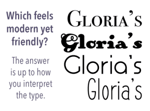 Icons are great, but I find that often, they work best when integrated with the type, so I just prefer to start there. Most typeface websites have a cool feature where you can see your sample text in the fonts that you’re browsing, so I set my sample type as Gloria’s, Breakfast • Brunch • Mimosas.
I stopped on the typeface Aspergit which stood out to me. It has a shape-based san-serif look that a trendy restaurant would employ, plus the letters got me thinking about how I could change the letters to help be part of the icon. I wanted to have a different typeface for the subtitle, so I continued my search. If they’re the same typeface but different styles, it can work, but I wanted something more playful to offset the trendy coolness of the main typeface.
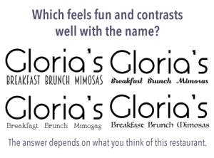 After some more searching, I came across BonteDivine, a serif typeface made of solid, unchanging strokes, and I loved that the letters tended to have little embellishments on them, especially in the lowercase s, r, and capital M.
This was perfect, because I wanted to follow up the very artsy and smart main typeface with something more fun, and the subtitle text is almost dancing, ESPECIALLY in the word “Mimosas.” With that, I had my typefaces!
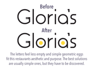
Now looking at the word Gloria in Aspergit, I had a few ideas for how I could turn the letters into something fun. The capital G in this type has a lot of negative space in it so I immediately thought of adding the tines of a fork onto it.
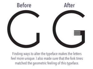 This added the food element that I wanted, because in the end, if someone sees just “Gloria’s” on a website, billboard, card, etc, I want them to know without a second thought that this place is a restaurant. The fork definitely does it, but the logo wasn’t fully there. I needed something else, which is where the other letters came to my aid. Looking at the wide-open negative space of the lowercase a and o it was as simple as adding a perfect sunshine yellow circle into the middle and turning those negative spaces into eggs! This was now a logo that was clearly food related, but specifically egg related, so I was in the right place! With that, my logo was just about complete. All I needed was a color scheme.
 The yellow was already set with the egg yolks, but I felt the black and yellow logo was a little too cold. I needed a color to bring some life to the restaurant, but I wanted it to stay classy at the same time. Going through a few color possibilities, I decided that a desaturated blue purple was the best possible choice: My main highlight color was yellow, so I wanted the supporting color to bolster it while at the same time having that feeling of “upscale restaurant.”
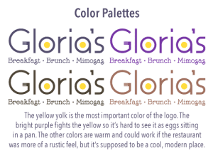 Purple, being yellows natural complement, was the ideal choice as its cool, regal meanings come across perfectly in this instance. The bright yellow of the eggs let you know this place is a bright, happy place to get egg related meals while at the same time, being a classy establishment. With these seemingly simple decisions, a word mark is created for an upscale brunch restaurant that caters to women primarily with its classy, modern charm but friendly atmosphere!
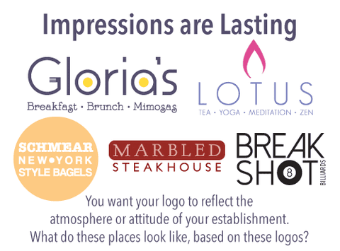
The decisions a designer will make can ultimately set the tone for your entire establishment. The above logo would not work if Gloria’s was more of a family diner style restaurant. The font and color choices would be drastically different, and even the egg and fork motif might have to change. When you commission a designer, you are commissioning an expert on symbology, so when you’re thinking about putting together a logo or asking someone to make one for you, make sure you’ve put real thought into what you want it to say about your business. If done properly, a logo can be an icon that stands the test of time alongside your establishment!
 Jorge Santiago Jr. is a graphic designer at Your Brand Cafe. He earned his BFA in Graphic Design from the University of Texas at El Paso and his MFA in Sequential Art from the Savannah College of Art and Design. His hair was voted, “Most Likely to Succeed,” and it has. He spends his free time creating sad comics and stories.
