

An eye-popping logo represents your brand in the best way possible. It helps consumers resonate with your branding and connect with what your brand has to offer.
In the coffee business, it’s no different. Independent coffee shops face some fierce competition, but they still have every opportunity to stand out. So where do you start? One of the best places is by looking right at your coffee shop logo design!
If you are a coffee shop owner, you know how important it is to have a unique and memorable coffee brand logo design that stands out. Well-designed coffee shop logos can attract customers and communicate your brand values.
In this article, we will explore some coffee shop logo design ideas and tips to help you create a coffee logo that stands out from the crowd. From choosing the right colors to creating coffee cups that show your brand identity through a deeper connection, we will cover the essential elements of how to design a coffee shop logo that will leave a lasting impression on your customers.
Keeping Your Coffee Logo Simple
Why does the most successful company in the world have a simple apple as their own logo? How about Nike? Certainly the “swoosh” logo isn’t a magnificent piece of art with a wow factor. However, these brands invested constant reinforcement into their branding until these simple logos turned into something iconic and became their perfect logo.
A simple coffee logo should represent your brand colors, but it should also be capable of being easily recognizable. It doesn’t always have to have your brand name on your coffee cups and coffee logos because people already know who you are! However, designing a strong coffee logo should convey your quality, values, and vision. Let’s look at Nike again, for instance: the simple swoosh represents motion, speed, and fluidity.
So when thinking of your perfect cafe logo ideas, try to keep it simple when coming up with your coffee shop logo design. Just take a look around your coffee shop, look at your coffee mugs or coffee cup and see what you think will be a simple, yet effective logo design that will help convey your branding while having a good logo design.
Think Longevity
The coffee industry doesn’t appear to be dying out anytime soon. In fact, it’s trending upwards, with over two-thirds of the American population drinking some form of coffee every day. With coffee’s continuous rise in popularity, you have to think about building a long-term brand. It may be tempting to create a trendy logo for your coffee shop, but beware that trends are meant to change and you could find yourself with an outdated coffee logo design sooner rather than later.
It can also be tricky singling out exactly what logo elements are outdated. So here’s a quick list of a few things to keep an eye out for that you may want to avoid:
- Overlapping Letters
- Arcs
- Slogans (Too much text)
- Several Shapes or Dots
- Multi-layered Text
- Dull Colors

Stay Consistent with Colors
Part of successful brand awareness means that consumers see your logo and immediately know what to expect. Your coffee shop logo design will stand out with eye-popping colors and designs that are consistent with your brand.
You know that the coffee chain juggernaut Starbucks has deep green, black, and white for logo colors. Actually, Starbucks labels their shade of green as their own color, “Starbucks Green”. Yes, the brand awareness of Starbucks is so strong that they have their own color shade!
While you have all kinds of colors to choose from, you should usually incorporate no more than three colors to make your brand logo stand out. Just like before, keep your coffee logo design colors simple.
Everything from your website to the inside of your coffee shop should be decorated with these colors. Your coffee cups, lids and cup sleeves are also great for brand colors because customers take these items outside of your store as free advertising. Then it won’t be long before people are asking your customers, “Oh, I like those colors, where did you get your coffee?”
Create A Deeper Meaning
This may sound tricky because we already mentioned keeping your logo simple. So how do you include a deeper meaning with your coffee logo design while keeping a minimalist approach? The important part is to know what your brand represents as a whole. Define your vision, mission, and core values and write them down.
A coffee shop could be many things including but not limited to:
- Energetic
- Soothing
- Natural
- Business-Oriented
- Affordable
Your colors are also a crucial element here because they create meaning for your brand. Think about a deep red which is passionate and exciting. A green may represent good health, nature, or money. Purple expresses sophistication while blue is calm and loyal. And having a consistent color scheme for your coffee logo design will not only help your overall branding, but may have people feeling a certain way when they drink from your coffee cup with your coffee logo.
When we look at Dunkin, we see very loud pink and orange colors. Dunkin creates a playful vibe with fun colors in their logo, but what does it remind us of? Fast-paced service with a drive-thru, rainbow sprinkled donuts, and a buzzing atmosphere. We are constantly reminded of what brands are trying to tell us through their logo.

Standing Out Sells
Making your logo stand out is a vital part of establishing a successful coffee shop. You have tough competition out there, but your coffee brand logo gives you an opportunity to shine. Successful coffee shops benefit from loyal customers who emotionally connect with their brand. While you’re at the drawing board for your coffee shop logo, think about what your brand represents.
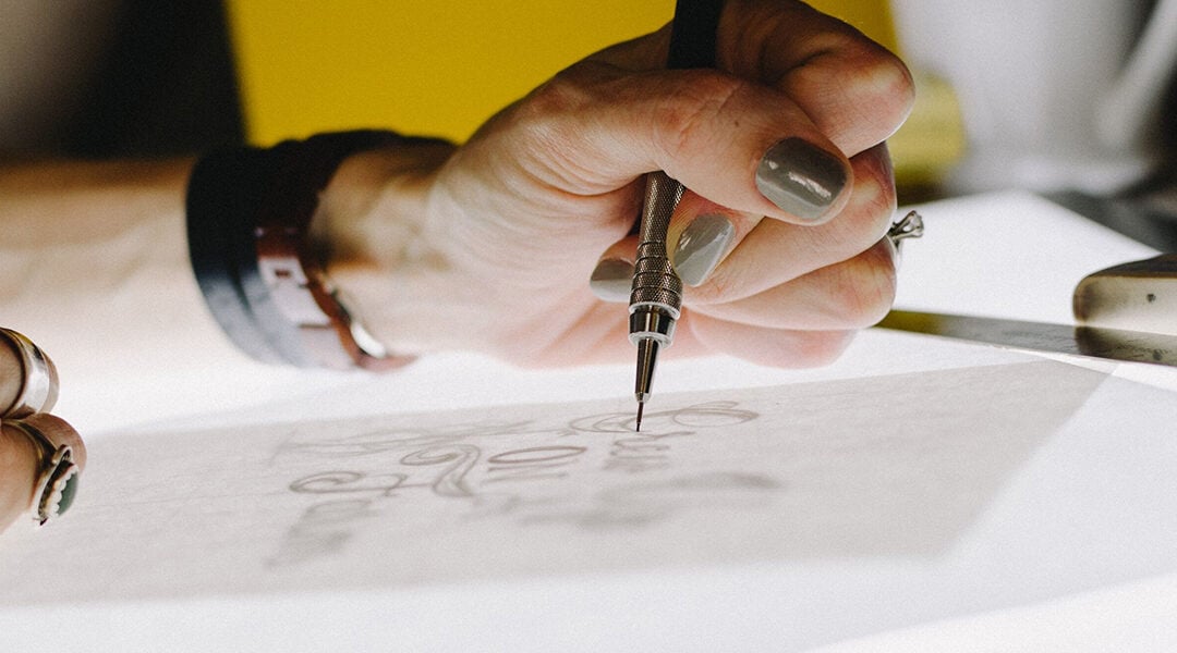
A standout logo can really make a difference in attracting customers and conveying your brand’s values. Keep in mind the importance of simplicity, longevity, color consistency, and deeper meaning when crafting your logo. And don’t forget the most crucial aspect: making sure it stands out from the rest of the pack. Armed with these pointers, you’re well on your way to creating a coffee shop logo that truly resonates with your customers. So grab your sketchbook and get those creative juices flowing!
Kyle Spearin
Kyle is a Boston native with a knack for SEO, writing, and editing content. Over the past three years, he's worked with venture backed startups and small businesses to expand their online presence. When he's not working on content, he enjoys hiking, football, and traveling with his wife.